Introduction
For this project first I came up with a series of denotative and connotative words based of my work and the artists I responded to in the abstraction project . Denotative is defined as the literal meaning , while connotative is defined as associated meanings . The series of words I came up with where :Shape(Bill Brandt) , Reflection (Saul letter ) ,Contortion (Francis Bacon) , Motion ( Vangelis Paterakis) , Identity ( Laurence Demaison) , Hue (Alex Deforest) , Vibrancy (Patrick Rochon) , Illuminated ( Man Ray) and Blur Bill Wadman . The three words I chose were reflection as I found the work of Saul leteir interesting however I wanted to explore different types of reflections as I had already made work based off of reflections from glass surfaces , for the next two words I wanted to create starting points of topics that I had not responded to before in my abstraction project most of the work I did for this project related to light or colour so I decided on Narrative because of its potential to develop onwards due to its broadness and Environment as this was a topic I was interesting in exploring as I had not responded to this before in the abstraction project .
Reflection
For this theme I wanted to explore the effects of the surface of the water on the subjects that are reflected into it and how by making the reflection itself the focus of the image I could manipulate the viewer's sense of perspective .
Andreas Gursky


Andreas Gursky is a German photographer known for his considerably large format images of landscapes taken from a bird's eye view . The aspect of his photography that made him rise to fame was his attention to detail within the frame and compositional techniques such as from above that emphasise the effect of his images .
Artist Inspiration
I will be responding to his work in Bangkok In which he depicts the Chao Phraya river but more specifically its surface whose ripples form the basis of an abstract piece of work . What I was inspired by in his work was his ability to manipulate the composition of the frame in order to compliment the details within it .
Planning
Pinterest Board

As I was interested in shooting into the water to capture the reflection in it I made a pinterest board with images based of this idea in both colour and black and white so I had collected ideas for both and could then decide which I would shoot in .
Contact Sheet


During this photo shoot I shot into a large body of water with the aim of displaying the alternate world within the water which is not usually highlighted as I have noticed that with images where something is reflected into water the image is composed into halves with one half being the subject and the other half below it being the reflected subject . I wanted to play with how the viewer would see the reflection as later I would be flipping the image so that the reflection would be upwards the same as the subject being reflected would look .
Favorite Shots
What I think worked well in this image is that details within the it become evident the longer the viewer stares at the photo such as the inverted plants lining the top of the frame and the land in the bottom that has been reflected beneath the birds .

What I liked about this image is that at first the angle seems quite simple for the viewer underneath the bridge however by including the detail of the lily pads the viewer realises this is a reflection taken above the bridge into the surface of the water that reflects the underside of the bridge .

What I like about this image is how the subject has been distorted by the ripples of the surface of the water

What I think worked well in this image was the layering within the frame . One layer is the cloudy surface of the water , the next layer is the the shadow formed the trees and the final layer within the outlined shadow of the tree is the reflected tree above .

What I like about this image is that I was able to sub frame the subject using the leaves which leads the viewer's attention to the subject who is surrounded by ripples in the water which helps the viewer come to the realization that the image is actually a reflection on the surface of the water

What I think worked well in this image Is the viewer's focus is directed at the red clothing of the subject then they look at the whole image to realise that the bridge is surrounded by the plants on the surface of the water making them realise it is a reflection .

Edits
|
|
For this edit I wanted to alter the texture of the surface of the water and make the subject in the water more defined
|


Evaluation

|

|
What differs between mine and the artist's work is that although their is a focus on the surface of the water in both in mine I aim to manipulate the viewer's sense of perspective by flipping the image to change what seems to be reflected and what actually is while in their work the surface is left unchanged and the ripples on the surface are the main focus rather than the reflection . What I think went well is I was able to utilize composition in order for the details in the frame to manipulate the viewer for example the photo above to the right . What I could have improved is to include more wide shots which would help me to relate to the artist more , I also could experimented more with sub framing using the details on the surface of the water that when the image was flipped at a 180 degree would appear around the edges of the frame .
Narrative
For this theme I wanted to create an ambiguous narrative within the images by leaving clues in the frame for each viewer to form their own meaning behind the photo as a whole .
Gregory Crewdson

|
|
Gregory Crewdson is an American photographer best known for his images that involve the constructions of sets and staging in order to create scenes with ambiguous narratives . He stated that the aim of his images are to search for a perfect moment this involves freezing the characters in the frame at the best time where a sense of mystery is formed around their story .
Artist Inspiration
What I was inspired by in his work was his creation of ambiguous narratives within the images . To make this response my own instead of creating elaborate sets I stayed consistent to only two locations to fully immerse the viewer into the world I had created and the character .
Planning
Pinterest Board

To generate my ideas for the shoot I created a mood board to collect and organise them . I looked at examples of the work of Gregory crewdson my link artist to give me a good starting point then from there I began gathering ideas that reflected the sense of ambiguity with subjects alone in the frame and their actions not immediately known to the viewer .
Favorite Shots
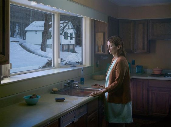
what I like about this image is the lighting pulls out the viewer's attention into the frame then as they look downwards they notice the detail of the part of the subject's body that is visible which forms a narrative on its own

What I think worked well in this image is the composition of it as I split the frame in half displaying the two rooms the viewer could focus on and by highlighting the contrast between the rooms in terms of colour and lighting they are first drawn the room on the left then they look closer at the darker room to the right and see the subject within the dark room . This forms an ambiguous narrative as the viewer can come up with their own conclusions as to why the subject is in that room in the position they are in .

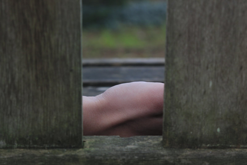
what I like about this image is it was aimed to be a POV shot from the gap between the door where someone is stealing a glimpse into the actions of th subject in the image . This forms an ambiguous narrative as the viewer can form their own ideas behind what the subject is doing as this is hidden from them .

For this image I purposely focused on the back of the subject rather than their reflection as this emphasizes a sense of mystery

Edit
|
|
For this edit I thought about ways to display the light that is falling in the gaps in the trees onto the ground I the image . Altering the image to an oil painting worked best as this helped to alter the text of the dappled light in the background. I also changed the hue of the image towards purple so that the ground would match the color of the shoe in the original image which make it longer for the viewer to discover the leg between the trees .
|

|

|
Evaluation


What differs between mine and the artist's work is that in their work the images are mostly full body shots with the subject in the centre of the frame while in mine the images consist of mostly the upper body with the placing of the subject varying in each image . Another difference is the scale in each work in his images the subject is isolated in a wider space while in mine the subject is positioned in rooms . What went well is I was able to create an ambiguous narrative in my images through the positioning of the subject for example the image in the woods with the subject's leg at the bottom corner of the image .What I could have improved is that some of my images are too dark next time I will adjust my ISO better to the light levels and I could add the use of props in order to have more elements in the image for the viewer to question.
Environment
For this theme I wanted to take this opportunity to explore my own environment this being my neighborhood . The definition of environment is the circumstances , objects or conditions by which one is surrounded . From this I decided to explore the objects in my neighbourhood this would give it character as the smaller details tell a lot more about a place than the larger details .
Sophie Calle

Sophie Calle is a french photographer who known for her images that examine ideas such as identity , privacy and intimacy . In her work titled room 47 she worked as a hotel maid and photographed the details within the rooms left by the people that had stayed there giving the viewer an insight into their personalities and identities . She uses a documentation style to reflect that of a detective investigating into the people which are unknown to both her and the viewer this involves sets of up to 6 images rigidly laid out together as if to pull details across the set to form an idea of the person .
Artist Inspiration
What I was inspired by in the artist's work was their ability to focus on the minute details within one area . How I will make the response my own is shoot over a larger area which will add an extra layer of depth into my images as it will be more difficult to uncover smaller details , I will also shoot in color rather than in black and white to
Planning
Pinterest Board
For this Pinterest board I collected images by Sophie Callie in order to try to figure out why she shot in black and white and how this helped her to display the details in her surroundings .

During this photo shoot I walked at random around the streets surrounding my home and first just tried to observe the details that would usually go unnoticed if one wasn't actively looking for them . I first captured the patterns created in the area such as that of on the lines on the pavement with a shadow across it then I looked at the details of objects in order to narrow down what kind of detail I wanted to capture and in order to relate to the artist more as objects were their primary focus .
Favorite Shots
What I think worked well in this image is the use of a macro shot which highlights the aspect of the unnoticed details within the environment

What I think worked well in this shot is the use of leading lines that focus the viewers attention towards the object

What I like about this image is its composition , within the frame a diagonal line cuts through the foreground of the image and in the background which is framed in this section is another diagonal line across the image . Additionally , by creating a sub frame within this image the viewer can come to notice the texture of the subject which relates to the aspect of detail

What I like about this photo is the dividing of the viewer's focus on the right leads down the street and on the left is the glass bottle left on the top of the wall

What I think worked well in this image is the narrative created by how the object has ended where it is within the environment

Edit
I edited this image into black and white in order to make it relate to the artist's work more as they shot in black and white .I also I thought that altering this photo to black and white the object would be more defined against its surroundings as it was a clear bottle against a dark brick wall

|

|
Evaluation


What differs between me and the artist is that their objective for the images is to document and try to investigate into the items and how their relate to the Peppe that last stayed in the room . While in my work I wanted to explore the relationship between the details around me an my environment . What went well in this theme was I was able to utilize a range of compositional techniques which included : perspective and leading. lines for example the image of the license plate on the road . . This helped me to make the response my own rather than a copy of the artist's work as these weren't as present in their images . What I could have improved is when I shoot up close on a subject think more about how i can incorporate the background into the image which will form an extra layer within the frame .I also could have experimented more with texture and how the viewer could discover what the subject is through the details in its texture
Development - Narrative
I decided to develop the theme of narrative as I believed this had the most potential to create multiple developments. This is due to both having the opportunity to experiment with all the different types of narrative but also this would allow me to shoot in a wider range of locations compared to the other themes such as reflection where I am restricted to areas with bodies of water .
Preparation
|
In order to develop this theme I needed to research around it so that I could gain a better understanding of how I could respond to it . The following are links to the research I looked at .
|
https://www.nownovel.com/blog/narrative-examples-strong-narration/ - This is a link to an article explaining five types of narrative : non linear , linear , view point , descriptive and historical
http://caraellisworkbook.weebly.com/brief-0---understanding-narratives.html# - This is a link to a university students weebly page on understanding narratives in photography. It includes explanations on circular , non linear, de centred , linear and user defined . https://www.alexprager.com/part-i-view/myzz58xo24imdux34jae4loj0pxk7t - This is a link to the work of a photographer called Alex Prager who I thought could be used to respond to in one of my shoots. Their work would fall under the category of non linear narratives using a set of images . |
Non Linear narrative
A non linear narrative otherwise known as a disjointed narrative is where a pattern of events don't follow a chronological order. Using the photographic medium how I will respond to this is create various sequences in which each image only has meaning once they are seen together .
Alex Prager

Alex Prager is an American photographer known for her images reminiscent of the classic Hollywood that involve large scale sets and actors . Her photos incorporate bold colors usually on the warm side of the spectrum which suggest comfort this contrasts with her narratives which are usually dark . In her work she creates sequences with a narrative which at first seems disjointed but after seeing all the images the viewer can connect them together.
Artist Inspiration
What I was inspired by in the artist's work was there ability to highlight the value of the images as a set rather than individually and how these work together to engage the viewer with aspects such as details which viewer can pull from across the different images in the sequence that relate to each other
Planning
Pinterest Board


In this mood board I gathered examples of subjects being isolated in green spaces as I knew that I wanted to use that as an idea for a photographer because my setting for the shoot would be a forest . After gathering images of Alex Prager I started looking at story boards and graphic novels as I was interested in how there is a progression from one frame in the story to the next and if the order of these was altered a new or different story could be formed . The graphic novel panels I collected took place in woodlands as this would help me get a better understanding of how I could display a sequence of events within my chosen setting being a forest .
Contact Sheets


For this photo shoot I shot in the woods as I believed this would help me create a surreal atmosphere which would benefit the non linear narrative . As the surreal aspect would draw the viewer into the image due to the appeal of the dream like landscape , this would then allow them to be more engaged with each image and be able to take details from them and discover the narrative .
Favorite Shots
Sequence 1
What I think went well in this sequence is the vibrant colour in the image this being green that draws the viewer into the frame .


Sequence 2
What I like about this sequence is the variety of perspectives from close up to upwards and over the shoulder which help to provide more context for the viewer as they look along the sequence


Sequence 3
what I like about this sequence is how the detail of the grass at first has no significance for the viewer in the first image but then by the end of the sequence the relationship between the subject and their surroundings is more defined .


Sequence 4
What I think worked well for this sequence is how the images work together as a set with a common detail this being the leaves although this is shown in different ways the viewer is still able to understand that the images work together as a whole rather than individually .


Evaluation

|

|
What went well in this shoot was I was able to implement details across the images in a set in order to highlight the value of these photos together rather than individual images such as in the first sequence with the context of the eye changing as one goes along the sequence as well as the leaves . Another aspect I thought went well was the use of a variety of angles in order to convey either details in the shot or show what the subject was looking at , these included behind the shoulder and close up shots for example the fourth sequence . What I could have improved is experimenting with opening shots that introduce the main setting and subject within the narrative .
Narrative Void
The definition of the word void is a completely empty space in the context of a narrative this would be the gaps in the story , what is not said between events . How I would relate this to photography is by creating narrative sequences in which the space between the frames is as significant as what is taking place in the photos on each side of it . A good example of a photographer that explores this is Mac Adams .
Mac Adams


Mac Adams is a British photographer whose work embraces aspects from film noir to crime scenes . He forms sequences with only two images in photography this is known as a diptych photograph . . The space between these images is left unexplained leaving it open to interpretation of the viewer what took place in the middle to lead to the events of the end. Mac Adam's images are in black and white so that viewer is not distracted by color which would disrupt them from studying each image to form their own conclusion as to what happened . He sometimes uses the same scene but divides it up leaving the viewer to look at each piece of the image one by one , this introduces new elements as the parts of the image are being looked at .
Artist Inspiration
What I was inspired by in the artist's work was his ability to get the viewer to study each image and form their own conclusion by highlighting the importance of the gap in the frames . I was also inspired by his use of other mediums such as that of film . How I will make the response my own is by using only one subject in the photos as this adds to the sense of mystery as the presence of another person is only felt once the only subject is harmed in the photo .
Planning
Pinterest Board


In this Pinterest board I looked at work of Mac Adams at the start in order to give me a starting point for generating my ideas then I gathered examples of film noir as this was a genre in which he took inspiration from . I also looked at stills from Alfred Hitchcock specifically his film Psycho as I found interesting certain angles that were used which I thought could be useful for my shoot such as the shot of the woman with her face pressed against the floor with her eye staring into the camera . I liked this angle as it was a good example of the type of dramatic atmosphere I wanted to be present in my images .
Random Word Generator
Another method I used to generate ideas for my photos was using a random word generator and then once the word had been generated I tried to relate it to my response and how I would form a concept for an image from it . Examples of this include the word summit which I thought the first image could be the subject looking out from the top of the hill and the second image would be their body on the ground at the bottom of it . Another example was the word strange , from this I thought about similar words such as odd and curious which lead me to an idea of the first image being one side of the tree and the next image being the second half of it with the subject look out from behind it . This relates to the words curios and odd as the subject would wonder what the subject is looking at and why they are hiding
Contact Sheets


During this photo shoot I went to various areas around the setting that I thought had potential to create narratives within . I found that paths and trees worked well as they could provide various possibilities of the start and end of the narrative such as behind the tree , against it , walking across it . I shot in colour so that lighting could then be more defined later when I edited them to black and white rather than shooting in it which can produce low tonal differences .
Favorite Shots
What I like about this set is that the viewer is lead across the photos as the same setting is combined together to form a narrative .


I happened to shoot this one in black and white, what I think worked well in it is that the differences in light between the inside and outside of the tunnel are contrasted which highlights the dark atmosphere in the set .


What I think worked well in this image is I continued on the positioning of the subject across the frames but the meaning of each half of their body is different in each image with one being a more light hearted beginning an the other a dramatic end to the narrative .


What I like about this image is that in the first the subject's face is hidden to the viewer and they are only introduced to it in the second image in the set where the subject's eyes are glazed over and cold against the surface of the tree .


What I think worked well in this set is the first image introduces the subject within the setting through a low angle this is continued in the second but now the subject is not as prominent in the frame causing the viewer to look around for them . This directs their attention along the path to the hand of the subject .


Edits
In these edits I altered most of the images to black and white to compare how the viewer would investigate the details within the images and form their idea of what took place in the gap between them .


Evaluation
What differs between mine and he artist's work is in my response I only had one subject within the frame in order to form a narrative around while they used multiple this makes my narratives more ambiguous as the person responsible is not present within the frame which adds to the mystery of the unexplained events in the gap in the middle. What went well is I was ale to both divide up the same setting to create a narrative such as in the first set but also contrasted the positioning of the subject to create a narrative like in the third set . What I could have improved is use an item such as an article of clothing to form a narrative by showing it on the subject in the first image but the second image being just the cap left within the frame .
Single Image narrative
For this shoot I wanted to shorten it down to one image that could form a narrative within it to compare and contrast the previous shoots that involved multiple images in a sequence . I also wanted to contrast the location of the shoot as I had already taken the previous images in a woodland setting so for this I decided to travel into central London specifically the Barbican estate which provides an environment of networks of buildings inspired by Brutalism .
Cristina Coral


Cristina Coral is an Italian photographer specializing in fine art photography . Her work explores the relationship between the subject and their environment which creates pieces that are suspended moments within a narrative with the subject frozen in an environment usually based indoors . She shoots in color so that the subject contrasts against their environment which allows the viewer to focus their attention on them opening up possibilities of a narrative that they believe exists within the image .
Artist Inspiration
What I was inspired by in the artist's work was their use of form , line which draw the viewer's focus in allowing them to focus on the subject's position within the frame creating possible narratives based on this . How I will make this response my own is by shooting outdoors utilizing the architecture and space to compose the subject . I will also try to manipulate the viewer's sense of perspective to emphasize the composition within the image and highlight the subject in the frame .
Planning
Pinterest Board

For this Pinterest Board I compiled a variety of Cristina Coral's work to identify common details and aspects of the image that would help me in my images such as her style of composition which involves experimenting with geometry and the subject's placement within the image to create a moment open to the viewer's interpretation . I also added a few examples from the film inception as there is a sense of altering perspective in the stills which is something I wanted to carry out in my work.
Contact Sheets


During this shoot I wanted to create a range of compositions and so I experimented with different ways of relating the subject to their environment such as them looking at a detail outside of the frame . This allowed me to both involve perspective and a sense of mystery as there is an aspect in the image which Is unknown to the viewer .
Favorite Shots
What I thought worked well in this image is I used negative space to constrain the subject within the frame which shows the limitations of his access to the outside world . By instructing the model to look at the area outside this helps create a narrative within the image that the viewer can come to read .

What I like about this image is first the viewer is drawn into the image through the perspective down the hall then they realise it is out of focus and the subject is in focus which alters the sense of perspective as they are pulled between two sides of the image .

What I think worked well in this image is I was able to emphasise the composition of the image by placing the subject at the centre of both the frame and the elements within the surroundings this being the lines that connect . This forms a narrative as the subject is alone their only interaction being with their inanimate surroundings .

What I think worked well in this image is that on one side of the image there is a more light hearted atmosphere with the yellow of the flowers and the relaxed subject yet on the other half of the image there are darker elements with some areas such as the bottom right completely submerged in the darkness . This forms a narrative as there is a sense of impending danger getting nearer to the subject . Additionally , at a second glance the viewer can come to notice the use of line and form with the lines of the architecture going across the image and the form of the subject's body following in the same direction .

What I think worked well in this image is the interplay of elements within the frame which introduces the subject entering the frame . This forms a narrative as this could both be the subject hiding from something or someone or them following someone in a stealthy manner . Both interpretation are up to the viewer's imagination .

What I like about this image is that the leading lines direct the viewer to the subject who is staring at something unknown to the viewer which creates a sense of ambiguity allowing the to create a narrative based on their own interpretation of what the subject is looking at .

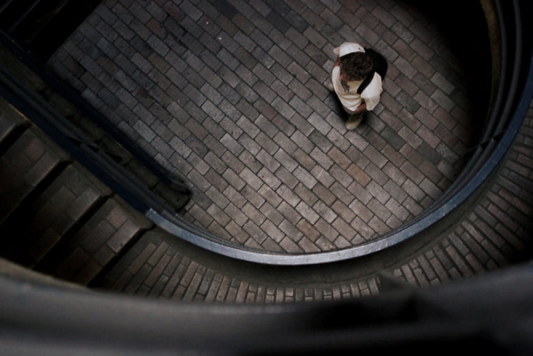
What I think worked well in this image is I used a high angle shot in order to make the subject appear vulnerable this encourages the viewer to search around the frame in order to try understand for themselves the danger the subject is .

What I think worked well in this image is its composition the path curves round towards the outside of the frame then there are the lines that cut horizontally above both, these aspects lead the viewer to the subject .

Edits
|
|
For this edit I increased the sharpness of the subject as I felt that in the original they were slightly blurred . Another thing I did was to increase the brightness of the background so that the subject was highlighted within the image against a striking backdrop .
|


Evaluation
|

|
What I think went well in this shoot is : I experimented with line and form combining both the subject's position in the frame and their surroundings to draw the viewer's focus allowing them to study the image and form a narrative for example in the fifth image , I was able to manipulate the viewer's sense of perspective in some of my shots through purposely making certain areas in the frame out of focus such as in the second image from the top .What I could have improved is making clearer that there is a possibility of a narrative with the images through overriding themes and details .
Non linear narrative - Development
Out of the three responses to the theme of narrative I decided to develop the non linear narrative theme . How I will develop onwards is by taking inspiration from aspects from the single image narrative and non linear narrative shoots I did . These aspects are exploring the relationship between figures and space from my single image narrative response and the importance of images as a set with each images importance only appearing fully to the viewer once they have seen every image . Additionally , what I will add to the non linear theme is the use of more close up and establishing shots .
Barbara Probst

Barbara Probst is a German photographer who creates sets or sequences of images that involve a non linear narrative . In her work she displays a scene from multiple view points which emphaises the value of the images together this not only helps form a non linear narrative as the scene becomes broken up with each image sharing a part of the scene but also reveals some of the various possibilities of narratives that are contained within each image . How non linear narratives are formed in her work is through the viewer being able to compare and relate details across the photos which gives meaning to the images which at first hold no meaning to the viewer before the other photos have been viewed .
Artist inspiration
What I was inspired by in the artist's work was their ability to give each photo more value once they have been seen together rather than individually . I was also inspired by how they incorporated both establishing shots of the area and close ups of the subjects in order to develop the narrative as details between the images relate which allows the viewer to connect the photos together . How I will make the response my own Is I will experiment with not only relating the details within one image to the next but also emphasizing their value together by having one aspect in the image continue on into another in the set such as a line running through the images .
Planning
Pinterest Board


For this pinterest board in order to generate ideas form my shoot I began looking at examples of subjects within architecture as I knew that my shoot would involve this as I wanted to continue explore the relationship between figures and space and how I could incorporate this into a narrative . To gain a better understanding of non linear sequences I looked at how they have been used in the medium of film and been implemented within their narratives to add depth to how the movie is perceived , for example in the movie memento by Christopher Nolan . In the movie there is intertwining of seemingly unconnected events at first then as it goes along the viewer can begin to unravel the whole narrative by connecting these events .
Contact Sheets


During this shoot in each area I would first take an establishing shot which tells the viewer the time of day , scale and where the narrative would take place then from there I would place the subject in this area and try different ways to display them in there while thinking about how the meaning of one shot is only present once another shot is shown to the viewer . For example if you place the subject next to a building then somewhere in the sequence you show the same building again the viewer will be able to connect these details together .
Favorite Shots
Sequence 1
In this set the eyes are an important detail as they provide the link that brings the images together . First , the viewer is introduced to the subject's eyes with an extreme close up this has no significance for them yet until the 3rd image where the eyes are covered by the metal pole which runs through the image . This pole then directs them along to the fourth image which has the same pole in it and the subject staring out to the opposite direction to where they are looking in the first . This image then relates to the second which introduces a pattern on the surface , this pattern becomes the ground that the subject sits on in the fourth photo.


Sequence 2
What I believe went well in this set is the aspect of lines which is a recurring detail in these images. Through these lines the viewer can notice both the visual link being the recurring detail and the physical link being the lines themselves which connect the third image to the fourth and then to the second. The line goes through the subject in the third photo to the fourth that has a line which directs the viewer diagonally up to the right where it wraps round the concrete block and is sent outwards by the subject who is facing the same direction


Sequence 3
What I think worked well in this sequence is the use of black and white which helps form the frames as together into one whole for example the negative space that is white in the second cuts diagonally to the left towards the third image which continues on this white space .I also like the shape element of the photos such as the silhouette of the subject with the defined outline of the structure of the face .


Sequence 4
What I like about this sequence is the subject is slowly revealed to the viewer bit by bit across the photos . I also like the yellow hue that is present across all the images which helps to establish them as one set .


Sequence 5
what I think worked well in this image is at first the details seem unrelated but then at a second glance the viewer can start to connect them as follows . The first photo relates to the fourth as the eyes of the subject are what is hidden behind the reflection in the fourth. The second image relates to the third as the reflection through a reflection which is present in both .


Evaluation


What differs between mine and the artist's work is that theirs the images in the sequence are connected through the use of multiple view points of a scene while in mine the photos form as a whole through aspects which travel travel from one image to the next such as the example above with the re occurring detail of a line . What is the same between my work and the artist's is that we both utilize close up and establishing shots within the sequences in order to add depth to the narratives by providing additional visual information . What I think went well in the shoot was that I was able to successfully experiment with contrasting and comparing details across the images in the sequences which helped to engage the viewer further for example in the first sequence I contrasted the detail of the eyes in one image it was a close p with no context then in another it was shot of their upper body with the context of the surrounding but the eyes were hidden by part of the environment this being the pole . Another aspect I believe was successful was the incorporation of establishing shots and more close ups which gave the viewer more information to work with in order to unravel the narrative , for example in the second sequence I combined shots of the surrounding and close ups of the subject's face . What I could have improved is that during the shoot I found it difficult to form narratives on the spot though I was able to create a relationship between the images in the sequences I believe I could make the sense of a narrative more defined .
Development 2
How this shoot will develop on from the last is by utilising what I liked from the previous development which was the non linear aspect and that the images work as a set but adding the element of scale. I will use the narrative of a crime scene, this is because crime scenes provide the chance to utilize multiple view points and details that help unravel the case holding the viewer's attention for longer. For this shoot I will go to Kings Cross specifically Granary Square as I know there are contrasting locations within this area which would provide multiple places to set a crime scene .
Izima Kaoru


Izima Kaouru is a Japanese photographer famous for his work entitled landscapes with a copse which explores the taboo of speaking about death in Japanese culture through a series of momento mori style images which remind the viewer of their death and of their own mortality . . To do this he asked the models what their death would be and then put this into image form through several sets of images consisting of up to 2-5 images . Each image shows a different view point of the subject and the scene of their death , this method of sequencing allows the viewer to come to terms with the scale of the scene as Izima tends to first document the moment from a far distance then after 2 or more photos provide a close up shot of the subject . This forces the viewer to face the subject who fills the frame which relates to Izima's objective to remind the viewer of human's mortality but also expressing the idea of looking back on ones life and knowing it was fulfilling so death is nothing to fear or avoid .
Artist Inspiration
What I was inspired by in the artist's work was their use of multiple viewpoints which allow the viewer to study each image to discover what lead to the subject's demise . I also was inspired by his sense of atmosphere which crime scene style photos present due to the morbid nature of what is in the frame . How I will make this response my own is beginning with a close up of the subject which at first has no significance to the viewer then gradually provide more context for the viewer as the distance from the subject increases.
Planning
Pinterest Board

For this Pinterest board I first collected examples of Azima's work in order to provide a starting point to generate my ideas then I moved onto looking at crime scene photographs these helped to show me how real life images still involve composition with examples of lading lines present . As well as composition these crime scene images helped me to think about how I would place the subject in the frame with different examples of scale like the artist . Finally , I looked at stills from the films of the director Wong Car Wai as in his films there are some great examples of sub framing which is defined as a compositional technique where one or more elements in the photo are framed by another element in the photo , this can be used to focus the viewer to areas in the frame or obscure parts of it which would relate to the crime scene aspect as certain clues are obscured and others the viewer is directed to .
Contact Sheets


During this shoot I stopped at different areas in the location then tried to build a narrative by first shooting the corpse of the subject which allowed me to build a sequence off of what was present in the frame . For example in the first sequence I began with the hand on the stairs then from there I could show how the subject walked up the stairs in the events leading up to this . Also I could contrast this hand in a different time in the events of the scene through placing it on a railing while they walk up the stairs which increases the significance of the hand in the first as it shows the scene of the crime while the other image shows a moment that lead up to it .
Favorite Shots
Sequence 1
What I like about this sequence is that I began with a close up of the subject's corpse which relates to the non linear aspect then began to introduce aspects such as the railing which provide the context for the scene .


Sequence 2
What I think worked well in this set is that by starting with a close up of the setting this has no significance for the subject then once they look at all the images they begin to realise that this first image could either be shown the beginning or end of the narrative as this is where the subject was both before and once they had died .I also think the covering of an eye in the third and fourth image works well as in both the subject is gazing off in to the distance but within contrasting circumstances .


Sequence 3
What I like about this sequence is the example of sub framing in the second image with out of focus areas on each side in the foreground then the subject framed within two columns in the background . I also like the close ups of the subject against their surroundings as they both contrast with the surface in terms of texture and colour .


Sequence 4
What I think worked well in this set is the close up shot of a part of the subject' s hand in the second image where the rest of the body splits the frame diagonally in half , I also like how the first image of the shoes and the last image have a different meaning to the viewer as one displays the events leading up to the subject's death and the other shows them when they are dead .


Evaluation

What differs between mine and the artist work is the sense of scale and how this is portrayed in a sequence . In Izima's work he goes from wide shots of the subject isolated in the frame to close ups of them killing the frame , while in mine I go the opposite starting with close ups and ending with slightly wider shots of the subject's whole body .What I think worked well in this development was the close ups of the subject that reveal different parts of their body within the scene . Examples of images that work well for this aspect are the second photo in sequence 4 as I wanted to experiment with sub framing . Another would be the fourth photo in sequence 2 which provides two pieces of key information at once , one being that the subject is dead as their eyes are glazed over and two where this deaths taken place through the plants next to them . What I could have improved is increasing the scale of the images as in Izima's work the subject is shot from a far distance which gives the viewer more context for the scene while in mine I only used medium shots and close ups .
Second response
For this I would like to shoot my response to landscape with a corpse again as I believe various improvements could be made now that I have reflected on my work . What I could improve is the distance from which I shoot the subject by incorporating wide shots which are more effective in drawing the viewer's focus as they are forced to search the image for a corpse as they are not immediately visible . To continue with the non linear aspect I will incorporate multiple view points which disrupt the flow of the narrative .
Contact sheets

Favorite Shots
Sequence 1
What I like about this sequence is the variety of view points that allow new details to be introduced which show the whole context of the image such as 5th photo which is split diagonally in half by a mass of black space then once the viewer sees the next photo they realise this dark area is actually a tree that was in the far corner .


Evaluation
What I think worked well in this shoot was I was able to incorporate in multiple wide shots within my response which helped create a more defined sense of scale from the first image in the sequence to the last , for example the first sequence has a clear widening scale as the sequence goes on . I also like the use of negative space which helps gradually lead the viewer to the subject and allow them to view the setting at a longer glance such as within the first sequence in the second photo .
Development 3
For this development I will refine the idea of a crime scene by using what worked well in the last development which were my close up shots of the subject which displayed different parts of their body within the scene . To develop onwards I will use mostly close ups to use as sources of information and context for the viewer to help them unravel the narratives . I will try to make the relationship between these close up shots and the narrative more defined in this development because I only touched on this idea in the previous development .
Melanie Pullen


Melanie Pullen is a Los Angeles based photographer famous for her work entitled high fashion crime scenes which was an investigation into how society has gradually become desensitised to violence due to the influence go media . In this project she gathered models who where dressed in designer pieces then composed them into a crime scene by re creating the stories of crimes from a book by Los Angeles police department . She dressed them in these elaborate pieces of clothing in order to disguise the morbid events and get the viewer to question why they are unfazed by violence they are shown in media . In her work she was inspired by the medium of film specifically its ability to display suspended moments within a narrative and display this narrative in a single shot . She was interested in the work of directors : Alfred Hitchcock , Stanley Kubrick and Bertolucci for their cinematography and the way in which they incorporated compositions within each shot of a scene .
Artist Inspiration
What I was inspired by in the artist's work was their interest in morbid events In a way that would engage the viewer due to the narrative of the crime which they could investigate . I was also inspired by their placing of the subject on the edge of the frame which allows the viewer to look around the rest of the frame and try to find clues before they get to the subject . How I will make this response my own is only using close up shots to build a narrative for the viewer .
Planning
A close up shot is defined as a shot of a subject or object at close range that shows greater detail and is tightly framed . It is used to reveal information or details about objects or settings and to draw the viewer into the subject's space .For this shoot the location will be Kew Gardens because the natural environment will allow me to experiment between the relationship between human form and nature .
Pinterest Board


For this pinterest board I collected ideas on human form as I knew I would be utilising the subject's body through close ups to form a narrative that is one to the viewer's interpretation . I also looked at the director's that Melanie Pullen took inspiration from such as Alfred Hitchock for example the stills of his film Psycho displayed good ideas of close ups of different parts of the subject's body before and after a scene of crime .
Contact Sheets


During this shoot as I was focused on using close ups I thought about how diferent shots of the subject's body allow the viewer to come to certain conclusions , for example a shot of the subject's hand against the ground hints to the viewer of the idea that the subject is dead as without seeing the rest of the body they can visualise that the subject is flat against the ground .
Favorite Shots
Sequence 1
What I think worked well in this sequence was the experimentation of human form and com positioning of the subject within the frame . For example the third image where the subject is at the far left of the frame and the body is contoured manipulating the viewer's perception of what a human body should look like .


Sequence 2
What I like about this sequence is how the viewer is drawn into the images through the use of depth of field such as in the third image where the body is out of focus but the arm is in focus . As well as in the fourth image where the face is out of focus but the bench is in focus which allows the viewer to notice the plaque used to commemorate those that have passed away reflecting the morbid nature of the scene .

Sequence 3
What I think worked well in this sequence was the orange hue that links all the images together due to the colour of the bricks .


Evaluation
What I think worked well in this development was the sub framing of the subject which allowed me to control the movement of the viewer's eye and direct them to certain details in the frame which they could use as clues. For example in the second sequence the subject is framed by the bench which leads the viewer to the subject's limp outstretched arm . Another aspect I believe worked well was giving different shots of the subject's body different meanings for the viewer in terms of the narrative for example a shot of the subject's hand with the palm facing upwards against the ground could symbolise to the viewer the subject's death as they visualise the rest of the body sprawled out on the floor . What I could have improved is developing a sense of atmosphere which will help both in terms of creating a narrative that is open to the viewer's interpretation and drawing their focus into the image .
Development 4
For this development how I will develop on wards is by moving away from utilising a crime scene to allow the viewer to study each image and how they relate and instead put more consideration into elements such as lighting to evoke an atmosphere which will aid in drawing their attention into the photo.
Wing Shya


Wing Shya is a Hong Kong photographer who became known through his on set stills of the films of director Wong kar Wai . He began by taking shots in between takes during the film Happy together(this is the image above to the right )then from this he was allowed to continue working with Wong Kar Wai by creating stills of the behind the scene and during takes on the film In the mood for love which is shown in the image above to the left . His work is inspired by the environment of Hong Kong due to the neon covered landscapes which are reflected in the vibrancy of his images .
Artist Inspiration
What I was inspired by the artist's work was their ability to evoke a certain atmosphere through defined contrasts from external lighting and vibrant colours. How I will make this response my own is by shooting when it's dark so that areas of contrast will be more readily available from sources of light within areas of darkness.
Planning


For this pinterest board I gathered photos by Wing Shya on set of the film by Wong Car Wai called In The Mood For Love which has clear examples of a deeply contrasted subject within a frame filled with only warm coloured hues . I also looked at stills from the film Drive which displayed the subject with parts of their face outside the rays of light and the other parts of their face with the light shining directly against it which helped evoke a mysterious atmosphere as some of the subject's facial features were hidden to the viewer.
Contact Sheet


During this photo shoot I walked around Muswell Hill and searched for sources of light in order to get the same ambience as the artist I focused on street lamps as they shine light from above which creates defined areas of contrast on the subject .
Favorite Shots
Sequence 1
What I like about these images is the areas of shadow that are directed against the subject in different areas of their body .


Evaluation


What I think worked well is I was able to experiment with areas of contrast against the subject due to how the light fell on them . I was also able to create some images with that included the subject's silhouette due to the contrast between the area of coloured light from the lamps and the areas outside the lights rays . What I could have improved is how in focus the subject was as in some of my images the subject is not in focus as due to the low light levels it was difficult to see whether the subject was in focus when altering the manual focus. To get round this issue I will light the subject separately using a torch to help me see if they are in focus . I also could have improved the colour in my images as the subject does not stand out enough .
Second response
In this re shoot I will give more consideration to lighting by lighting the subject separately with a torch , I will try a different location for this shoot to find an area that provides a variety shadows and different compositional opportunities for example more of an emphasis of how the subject is framed within the image . Some locations I could try are Alexandra Park station and Highgate station . In order to address the issue of colour in my images I will think about what the subject could wear in order for them to be highlighted within the frame such as vibrant colours to help the stand out in the dark.
Planning
Pinterest Board


|
|
For this Pinterest Board I first gathered stills from the film In The Mood For Love by Wong Car Wai as this provided ideas on ways to light the subject and make the subject visually prominent within the frame through contrasting colours. I also collected images taken on train platforms to gain a better understanding of the setting.
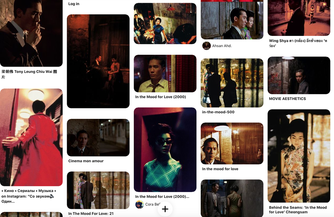
Wong kar Wai


Wong Kar Wai is a Hong Kong director who achieved international status through his films such as In The Mood For Love and Chungking Express. He was a part of Hong Kong's second new wave of cinema that investigated themes such as human psyche, time and social conditions. His distinct cinematic traits include detailed compositions, sense of nostalgia and experimentations with color.
Artist Inspiration
What I was inspired by in his work Is his defined lighting of the subject as well as the composition of his shots that utilize both the method of sub framing and contrast.
Contact Sheets

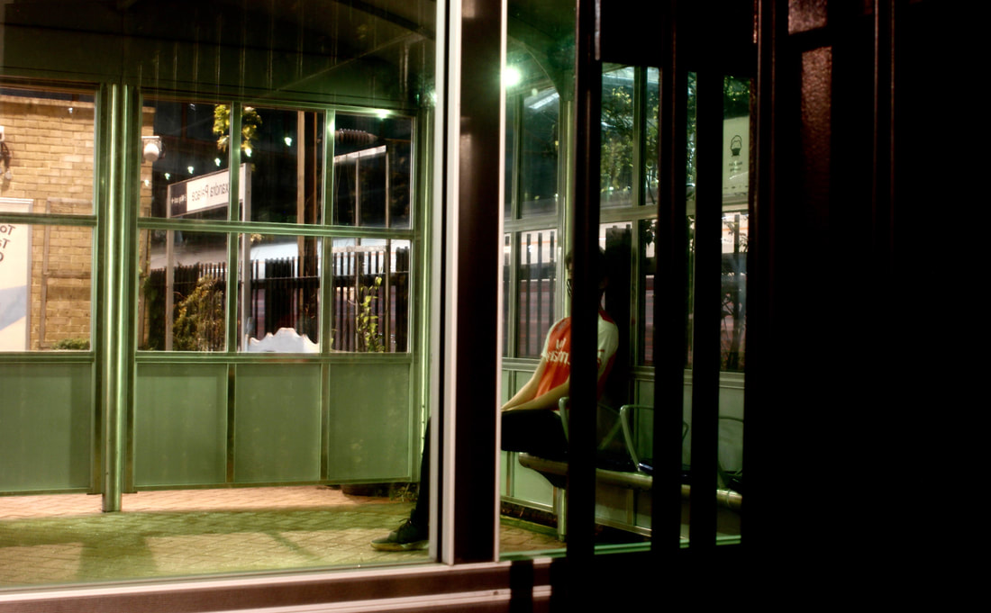
For this photoshoot I went to Alexandra Palace Station for when the sun set as I wanted to shoot when it was dark in order for the light to cast more defined shadows. I began trying out different ways for the subject to look towards a light source above them then from this I tried placing them within one of the shelters in the station as this both isolated the subject and provided a more vibrant light source with the green lights along the ceiling. On top of this I experimented with shooting the subject's reflection in order to highlight their red shirt within the frame.
Favorite Shots
Sequence 1
What I think worked well in this sequence is the vivid green from the lights which draws the viewer's attention then they notice the composition of each image with their horizontal and vertical lines which meet at various points in the frame.


Sequence 2
What I like about this sequence is how the images work together by having the subject gaze out in opposite directions in each photo. This allows the viewer to form their own idea as to what the subject is looking at outside the frame.By altering the direction the subject was facing this also provided different versions of how the available light shone on their face and body.


Sequence 3
What I think worked well in this sequence is the various ways in which the subject's identity is obscured or at least distorted by the reflection created in the glass. I also believe the


Sequence 4


I also believe the following three images work well together as another possible sequence due to the aspect of obscuring the subject being displayed in three different ways. One image obscures the subject through motion, the second photo through the composition within the frame that divides the subject into individual parts with each part of them separated by the black bars and finally the third image obscures the subject with a reflection that both distorts them and covers their facial features due to the bold letters.


Edits
For this edit I wanted to experiment with warm hues which would help my work relate more to that of Wing Shya.

For this edit I altered the filter of the image to a deep red which provides a defined warm colour with the shadow across one half o their body contrasted more.

For this edit I altered the hue to purple and increased the vibrancy so that the elements within the reflection became more defined such as the outer wall of the shelter.

For this edit Instead of making the colour in the photo warmer I wanted to make it cooler because then there would be a clearer contrast between the subject and their surroundings.


Evaluation
What I think worked well in this shoot was that I was able to improve both the quality and variety of lighting that was shining on the subject such as the second image in the second sequence. I was also able to resolve the issue of the subject being out of focus by putting more though into how I would position the subject under the lighting. I also liked the images that have a sense of layering such as the fourth image in the first sequence. By shooting outside looking in this influences the viewer to feel that there is a distance between them and the subject and for them to question whether they are part of the narrative in the photo a bystander watching the events unfold. Further more, this photo has a defined foreground, background and subject with the foreground being the window frame this leads the viewer inside to the subject behind the window and then they are brought to the back of the image where the other side of the shelter is shown isolating the subject further.What I could have improved is that in some of my images the lens flares are too defined and may distract the viewer from looking at the subject.
Development 5
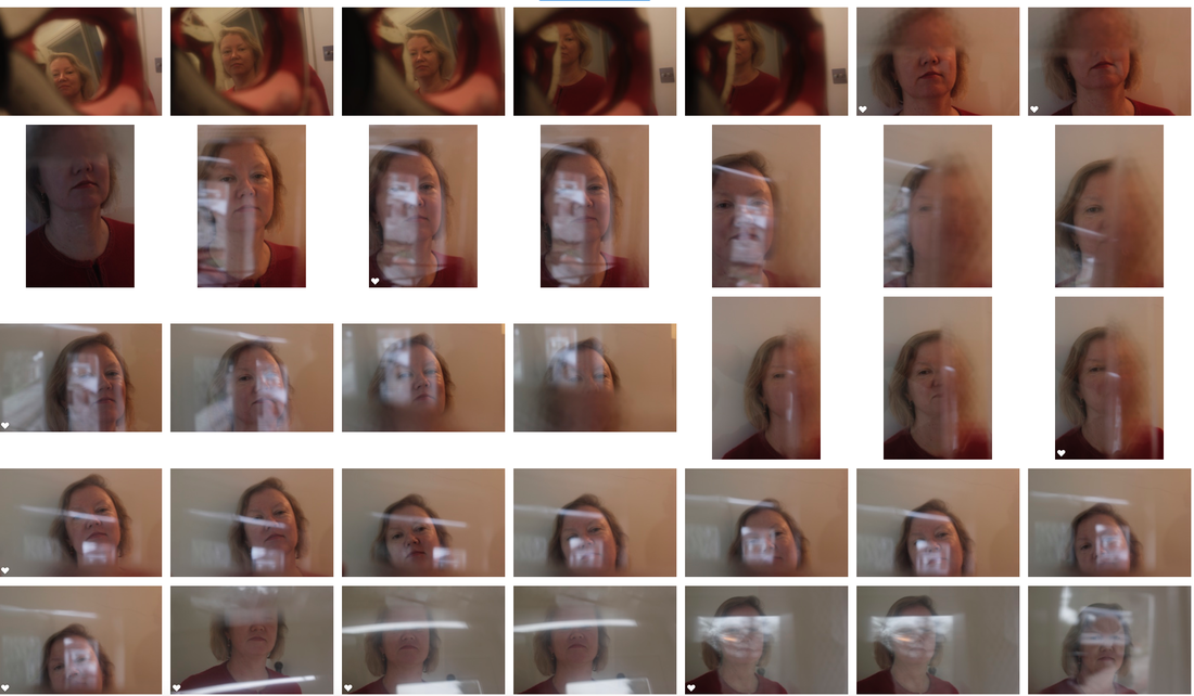
For this development I will use what I think worked well in the last shoot which was method of layering which incorporates the foreground, subject and background so that all the elements in the photo work together.This can also help to form an ambiguous narrative such as the subject being isolated in the frame leads to questions of what lead to them being there and why they are alone. I will also think about how I will obscure the subject such as in the first sequence in the last shoot. This will work well with the method of layering as the subject can be obscured by aspects in the foreground. Some artists I could look at for this are Saul leiter and Erns Haas.
Saul Leiter
Saul Leiter is an American photographer known for his pioneering work in colour which stemmed from his beginnings as a painter. This start asa painter not only aided in how he saw colour but also in how he was bale to create compositions. To form these composition he shot through aspects such as windows which provided a layer between the viewer and the subject while also abstracting them in the process.The motif of umbrellas was a recurring theme in his work as their circular geometry stood out amongst the various horizontal and diagonal lines.Unlike his contemporaries who were capturing the bleak aspects of society such as Diane Arbus shooting in black and white to enhance the morbid nature of the images, Saul was one of the first to take up colour film which was looked down upon at the time and transform the otherwise mundane city life of New York into an environment filled with unnoticed beauty.


Artist Inspiration
What I was inspired by in the artist's work was their use of layering by shooting through reflective surfaces and combing elements at different depths of field . How I will make this response my own is by forming a relationship between the subject and the viewer who acts as an onlooker within the scene with a sense of separation between them from a surface.
Contact Sheets
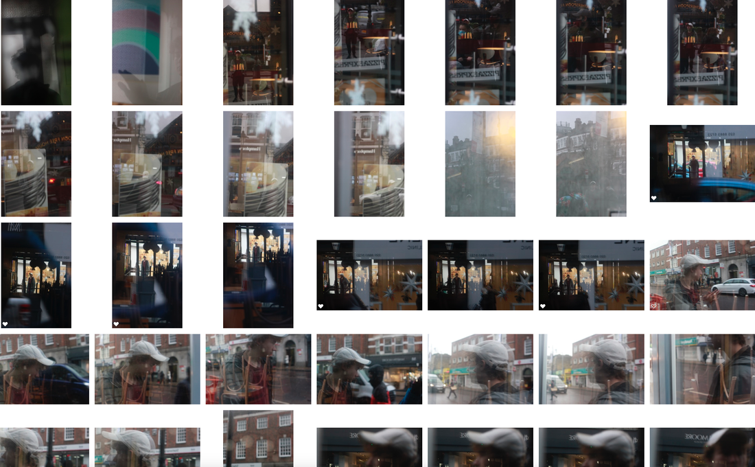
During this photo shoot I placed the subject in front a variety of reflective surfaces, I found that shop windows worked best as they allow capturing the elements within the shop and the aspects being reflected outside the frame which relates to my aim of layering.
Favorite Shots
Sequence 1
What I like about this sequence is that the positioning of the subject comes full circle at the end of the sequence beginning with the subject gazing into the camera then the second photo displays the subject looking to the right with one side of their face covered, next they is facing the opposite direction with the other side of their face obscured and finally in the last image the subject is looking into a window linking to the first image but now they are looking in from the outside rather than seemingly being trapped on the inside looking outwards.


Sequence 2
What I think worked well in this image is how the subject is obscured utilizing the the foreground this being what's on the inside of the glass and the background this being what's being reflected directly behind the subject.

What I like about this image is that the subject creates an opening into the the inside of the shop window with the L inside which aids to obscure their facial features.

What I think worked well in this image is the different colors which draw the viewer into the photo

What I like about this photo is the physical layering of the frame by the strips of blue.

Evaluation

What I think worked well in this shoot was the aspect of layering by combining multiple elements into one image such as in the first sequence where there is the combination of the subject, the window it self and what is being reflected behind the subject. Another aspect I think worked well was obscuring the subject which is an aspect I touched on in the last shoot.What I could have improved is the brightness in my photos as some of the images are too dark and contain some grain as I was using the wrong ISO for the light levels that day.
Development 6
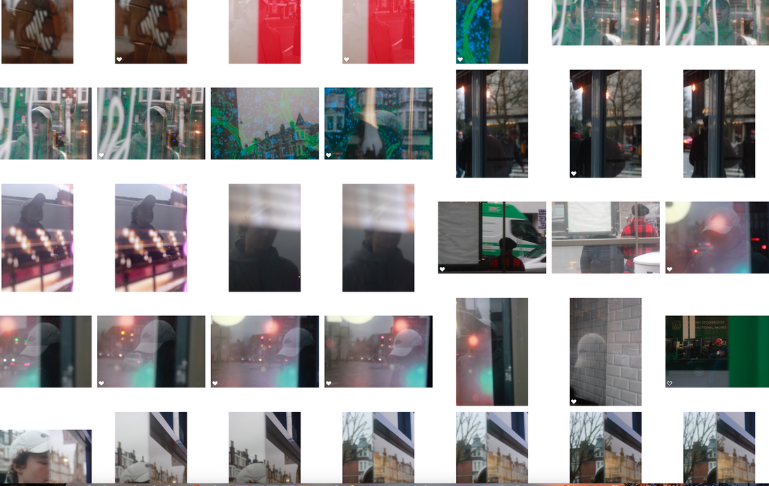
For this development my aim was to continue with utilizing reflections in order to distort the subject however this time I would be manipulating the reflections rather than placing the subject based on the stationary reflections from shop windows. I also aim to make sure that the aspect of color is present in these photos, to do this I will instruct the model to wear something with a bright color such as yellow or red.
Contact Sheets

During this photoshoot I tried to incorporate a variety of reflections in order to display different possibilities of how the subject could be distorted. I started by exploring placing the model behind a glass stained door and in the a gap where the it was glass have their eye in it leaving just one part of the subject's face un altered. Afterwards,I utilized a mirrored cupboard and shifted my position as well as how open one side of it would be in order to create a striking split in the frame. Finally, I found best success in using a piece of reflective plastic and placing it in front of the subject's face so that what was being reflected in it would be displayed on the model's face creating a double exposure effect.
Favorite Shots
Sequence 1
What I like about this sequence is how it goes against the viewer's expectation of the pattern of the sequence this being the gradual reveal of the subject as a whole. This is because the set begins with one eye of the subject unobscured then one side of their face however I decided to make the last photo one that displayed all of the subject's face obscured.


Sequence 2
What I believe worked well in this sequence was how the subject becomes enshrouded by the elements into background which are being reflected on their face.


Sequence 3
What I like about this sequence is how the elements in the frame become compacted in left with only a piece of the subject's face visible.


Edits
For these edits my aim was to experiment with both warm and cold hues in order to abstract the subject further while adding depth and emotion to the images through what the subject associates the colors with.


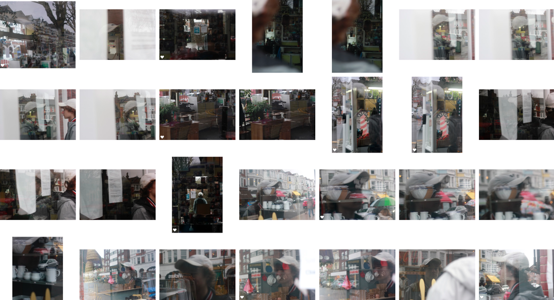
Development 7
For this development I continued with creating distorted portraits however I returned to utilizing shop windows as I believe these were more successful in layering as there were more elements within the background as well as details within the shop windows. How I developed on from the last shoot utilizing these shop windows is more consideration into the available sources of color that would attract the viewer's attention into the image as well as my composition by forming the double exposure effect with the layers of reflections in the frame. Both these aspects relate back to the link artist Saul Leiter due to the emphasis on composition and the element of color.
Contact sheets


Favorite Shots
Sequence 1
What is successful about this sequence is as it progresses the subject becomes gradually more abstracted by the layers in the frame. First, the bright green graffiti on the glass then by the overlaying of the reflection created by the glass in front of them.


Sequence 2
What I like about this sequence is how the amount of space the subject fills in the frame increases the position of the reflection directed onto them shifts around their face.


Sequence 3
What is successful about this sequence is the double exposure effect created by the reflection which fuses the details in the surroundings with the subject obscuring their identity in the process.


Possible sequences
The following are experimentations into the arrangement of the above images into narrative sequences
Sequence 4


Sequence 5

Sequence 6


Edits


Evaluation
What I believe worked well in this development was highlighting of pockets of clusters of color within the frame that relate to the link artist Saul Leiter's work as his images contained muted overtones but with areas of red and yellow that would direct the viewer's attention. Examples of this include the photos in sequence 2 . Another aspect that worked well was improvement of the relationship between the subject and the surrounding reflections which has become more complex due to the overlaying of the background against them.What could be improved is the arrangement of the photos next to each other as they are displayed in the same way as vertical individual images.
Development 8
For this development what i will utilize from the the last shoot is the colorization inspired by Saul Leiter. To develop this onwards I will put more consideration into the arragment of the sequences by placing them as sets rather than individual photos that make up a sequence. This will allow me to extend the narrative as well as I can create a journey within the sequence by including images of the reflection it self then adding the subject into the frame. A link artist I can use for inspiration for this shoot would be Edward Yang a director whose cinematography in the film Yi Yi had high quality shots of reflections alongside characters.
Edward Yang
Edward Yang is a Taiwanese director who gained international recognition from the film Yi Yi and A bright summer day. He was a pioneer of the new Taiwan cinema movement through his in depth investigation into city life. Yang utilizes window panes to double the dynamics: by overlapping the reflection or the refraction of another environment to the main action.

Artist Inspiration
What I was inspired by in the artist's work was their ability to heighten the interaction between the subject, foreground and background by utilizing reflections. I was also influenced by their ability to create a journey for the viewer within the sequence by alternating between the reflection as the main subject and the person within the photo as the main subject.
Contact Sheets
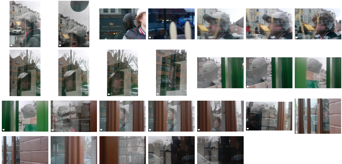
Favorite Shots
Sequence 1
What I like about this sequence is how it's layered with the foreground, background and subject all interacting at once within the frame. A good example of this is the first photo that depicts the subject projected onto the window with one side of them being the outside of the shop and the other the inside of it behind the glass.


Sequence 2
What worked well in this sequence is how it progresses with each image providing a new perspective of the setting in which the subject is placed.


Sequence 3
What I like about this sequence is the alternation between shots of the reflection alone then the subject placed within it, extending the narrative in the process.


Evaluation

What I think worked well in this shoot was I was able to provide a variety of experiments with the arrangement of my images in a sequence. I also believe the depth of the sequences was improved by switching from the reflection it self and the subject within this reflection which aids in extending the narrative for example the sequence 3. Another aspect I believe was successful was the range of angles that provide different viewpoints of the same scene such as in the second sequence. What could be improved is the level at which the photos are shot as I kept to eye level rather than trying low angles to give the subject a sense of dominance adding depth in the process.
Development 9
For this development I intend to keep consistent one colour range to make sure the sequences are held together. Additionally, I will refine the layering used in the previous shots by placing more consideration into various scales of the subject so that the viewer must search the frame to find them.
Paola Franqui


Paola is a Puerto Rican photographer interested in capturing the intimate moments of those in her surroundings. In her recent project reflection stories she took inspiration from photographers such as Saul Leiter and Vivian Maier who excelled in pushing the boundaries of photography through reflections. These reflections allowed her to think of new perspectives to display the subjects and try to understand what each of their own stories are.
Artist Inspiration
What I was inspired by in the artist's work was their use of scale with shots that aren't always close ups with the subject dominating the frame but taken at further distances allowing the viewer to search for them.
Contact Sheets


Favorite Shots
Sequence 1
What I like about this sequence is the positioning of the subject both in the foreground and the background which directs the viewer from one area in the frame to another engaging them in the process.


Sequence 2
What went well in this sequence is how the the vivid red colour presents itself as the sequence progresses.


Sequence 3
What I like about this sequence is how the subject takes hold of a different side of the frame gazing outside it in each photo. They seem to leave the image in the beginning and re enter by the end of the sequence.


Final Piece
For my final piece I will be forming a final combination of the images that have worked best in each development.


Evaluation
I believe this final piece was successful In realising my intentions for the project as the images included the method of layering which aids an ambitious narrative as the viewer can decide for themselves how the elements in the frame correlate. Additionally, the distorting of the subject's identity highlighted the ambiguity of the narrative as it was up for the viewer to make conclusions based on the information they have been given.
Final evaluation
What was successful about this project is I was able aid the viewer in their own understanding of each image through the non linear basis of the sequences. One of the challenges I faced during this project was how defined the narrative was in order to overcome this I placed more consideration into the lighting and colour of the images in order to evoke a mood. What I could have improved is establishing a continuous colour range in my images in order to hold the series together. Additionally, I could have experimented more with the scale of my photos as in the majority the subject is dominating the frame. In stead I could have played more with positioning the subject to the outside of the frame allowing the viewer to search for them.
